Tennis with Science is a platform dedicated to reducing the lack of information available regarding health in tennis.
Its mission is to share information and promote exchange between professionals and athletes in the tennis community.
The goal was to develop a visual identity for Tennis with Science from scratch.

My goal was to develop a visual identity that would convey the energy and sense of movement associated with tennis.
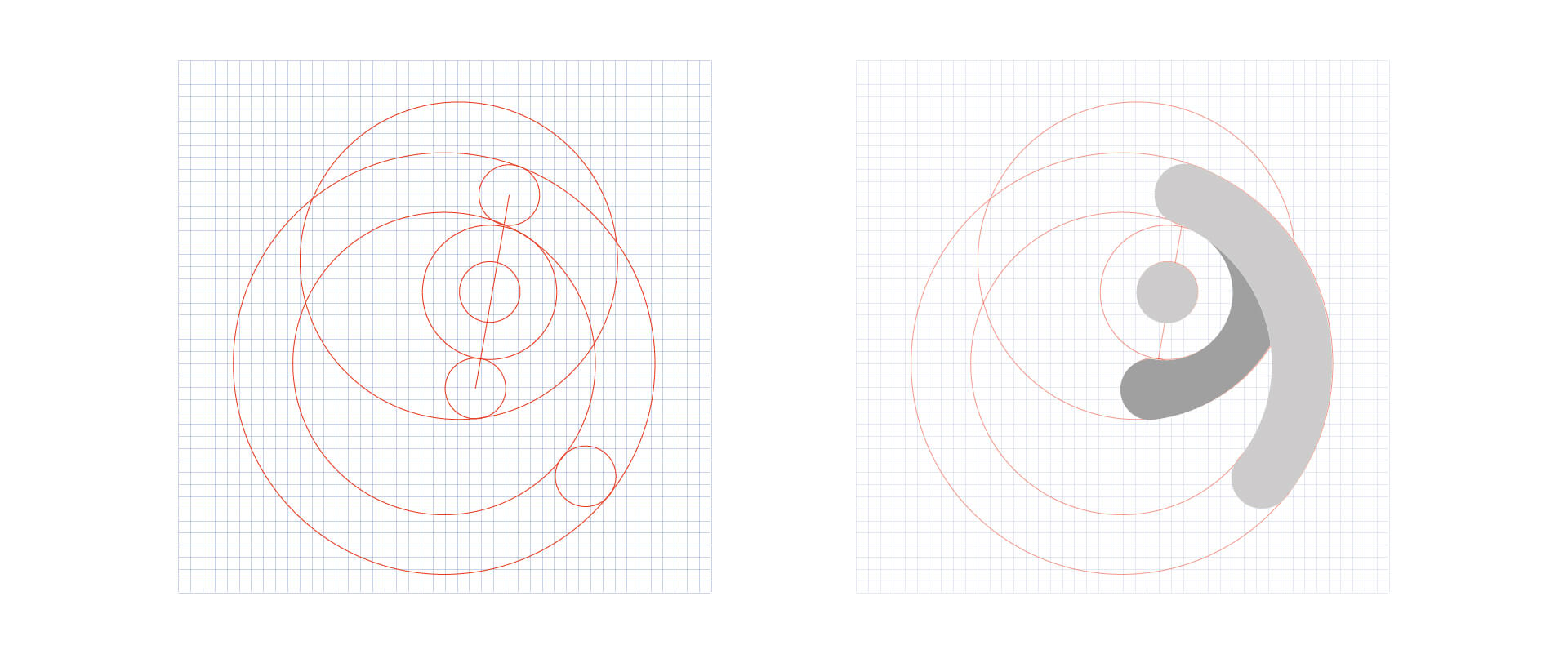
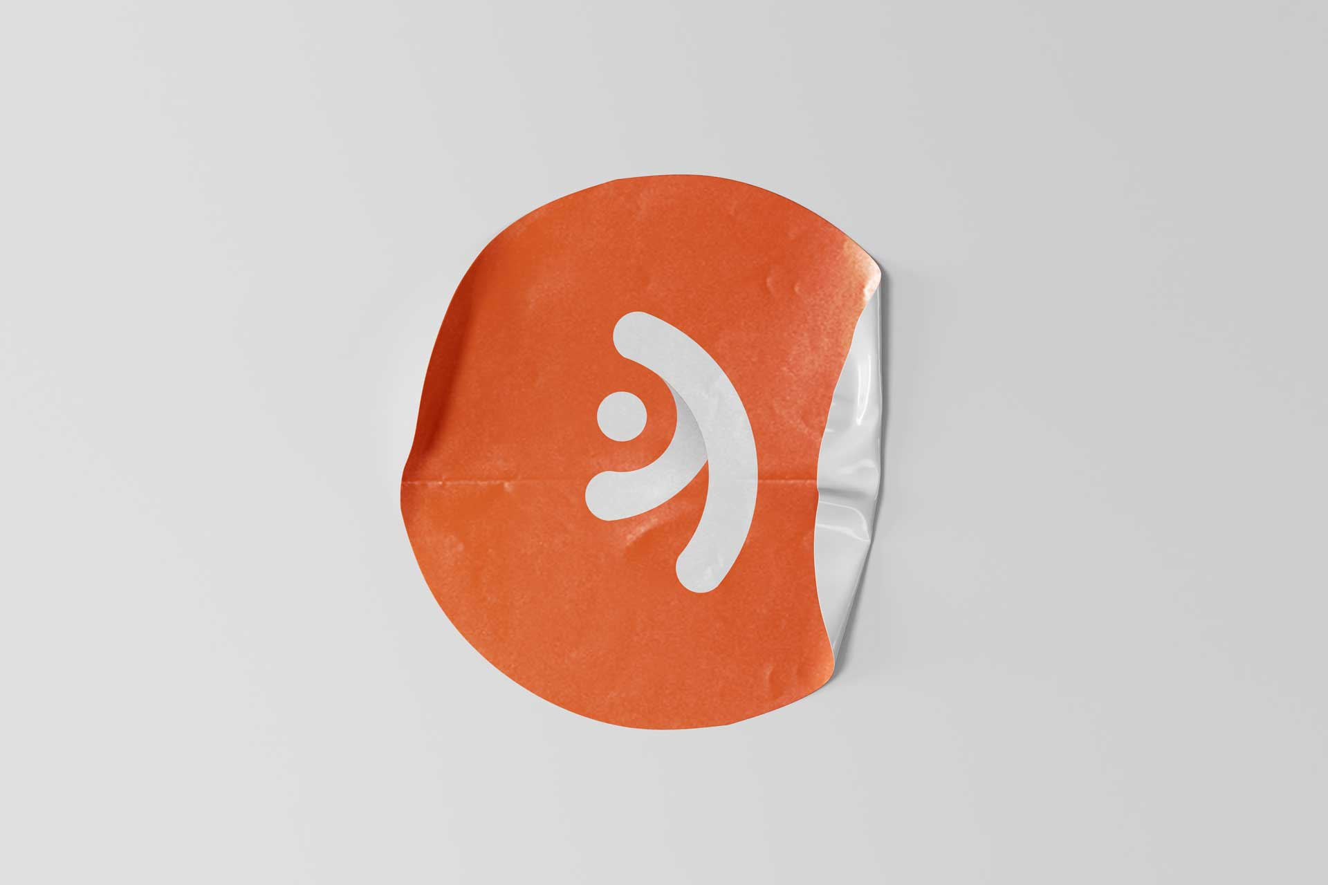
One key inspiration was the circular shape, which I saw as a metaphor for both the kinetic chain in tennis and the tennis ball. I used this shape as the foundation for the logo design, creating a sleek and modern emblem that would easily catch the eye of tennis enthusiasts.


The color palette for Tennis with Science was carefully chosen to evoke the energy, excitement, and dynamism of the sport. The primary colors, orange and yellow, were inspired by the clay of tennis courts, evoking a sense of the game’s heritage and tradition. The complementary color, blue, was chosen to balance the warmth of the orange and yellow, adding a touch of coolness and stability to the overall design.
The resulting palette is bold, energetic, and perfectly captures the essence of the sport and the platform’s mission to provide information and resources for tennis enthusiasts.


