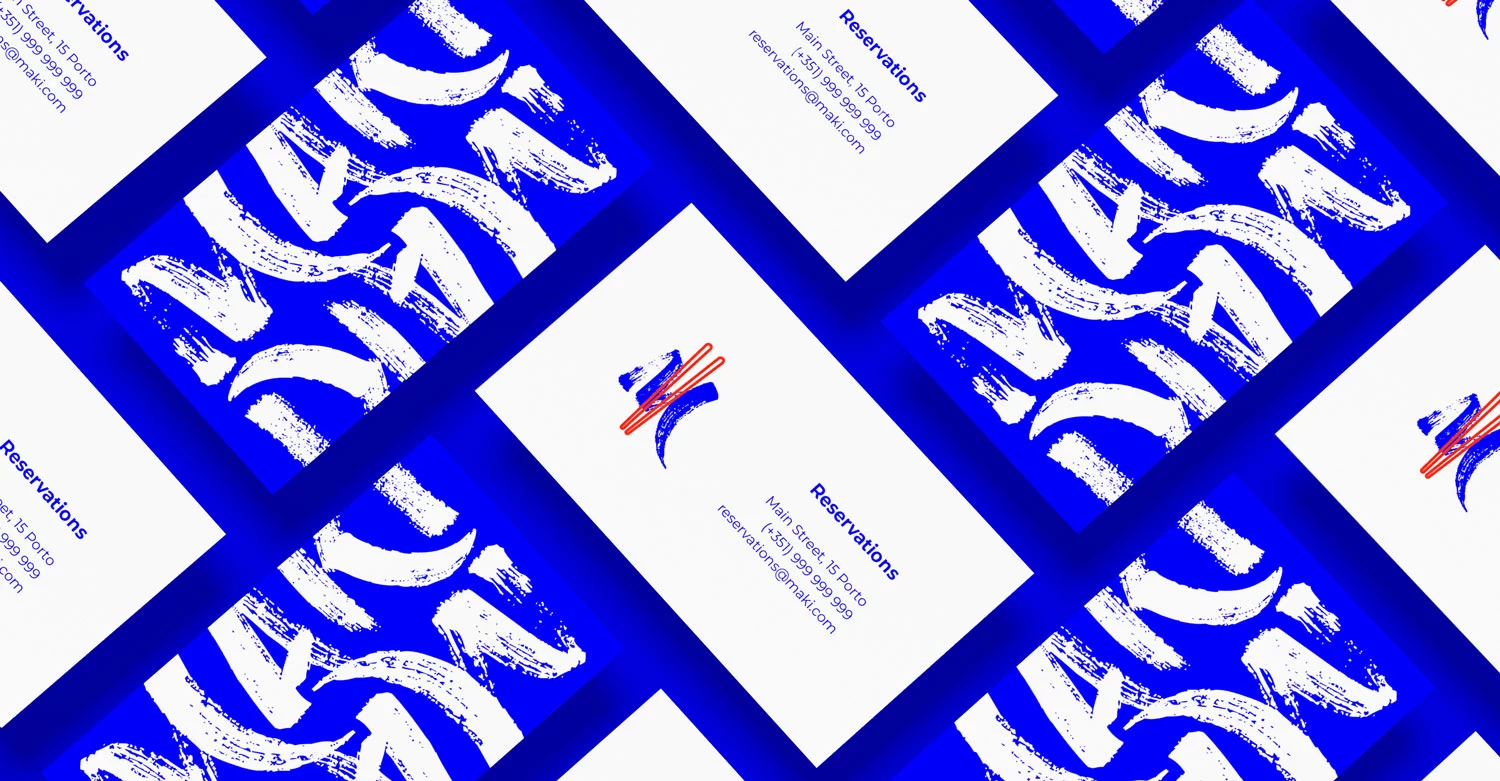
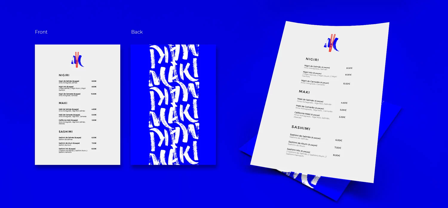
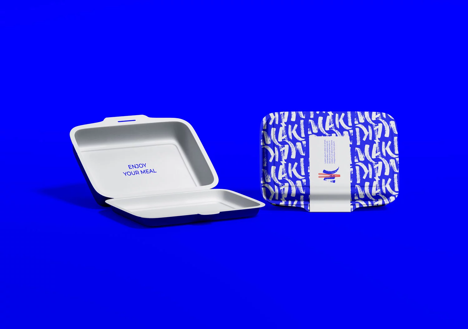
Maki is a modern sushi restaurant with a young team. In this overflown market, they needed a brand identity that makes them stand out from the crowd.
They identify themselves as a modern, vibrant and fresh, and wanted to present themselves as a bright but also inviting brand.
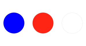
Along side of understandable simple shapes, I created a colour palette that brings joy, offering a playful vibe.

My approach on this project was to create a bold and loud branding for Maki.
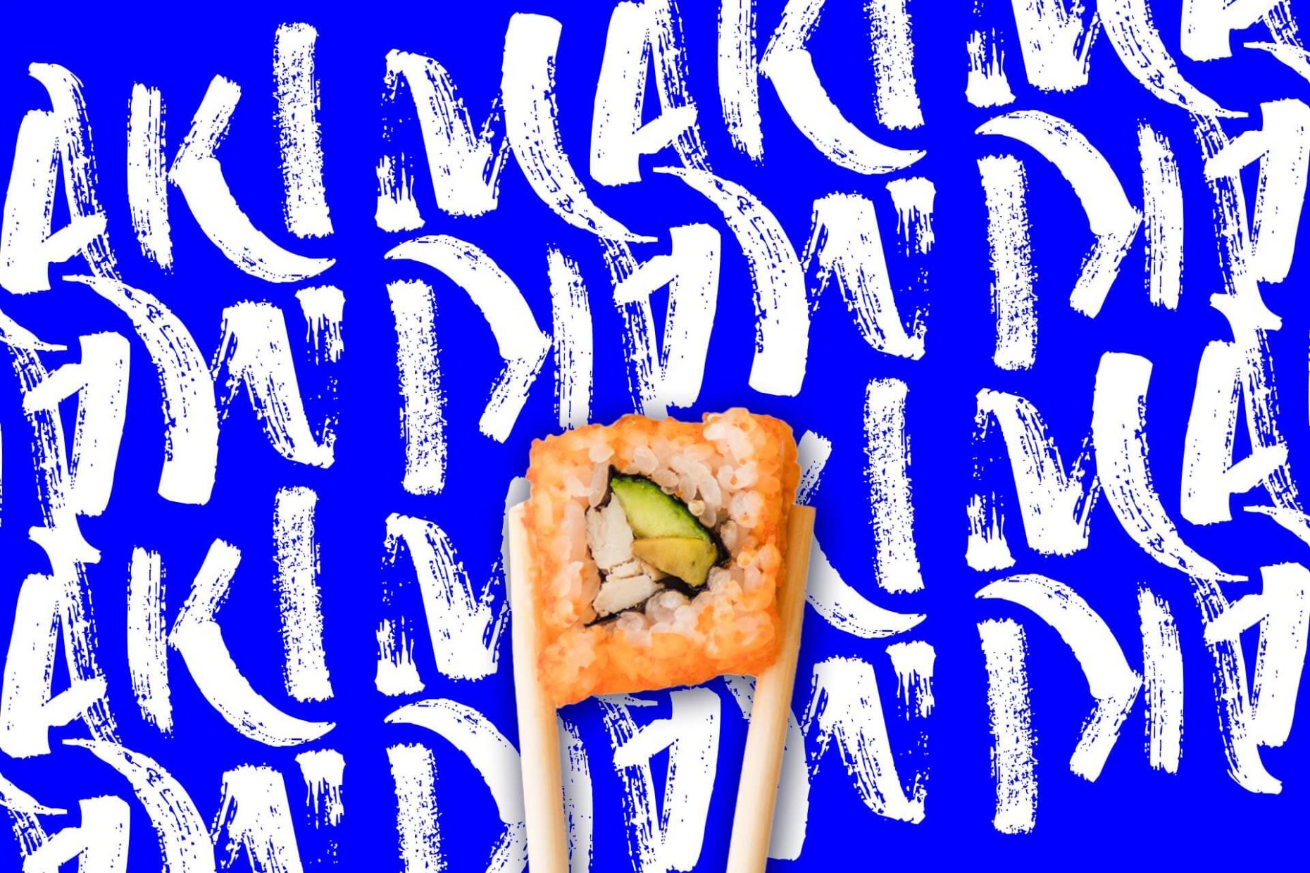
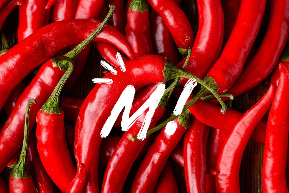
I paired name written in a dry brush style with a strong and saturated colour palette.
From the main wordmark, i used the letter M to create a symbol to use on smaller applications. I ended up using the wordmark as a graphic pattern.
