Kids Club is a preschool and daycare center that offers a fun and nurturing environment while provides preparation for school years
My role was to develop a visual identity that was simple but distinct, that would stand out among other daycares.
I created a fun and impactful brand that reflects the cheerful vibe of a dar care.
A fun and playful branding can help a preschool differentiate itself from other preschools that may have a more traditional or serious branding. By having a unique and recognizable look, the preschool can create a memorable impression on families and stand out in their minds.
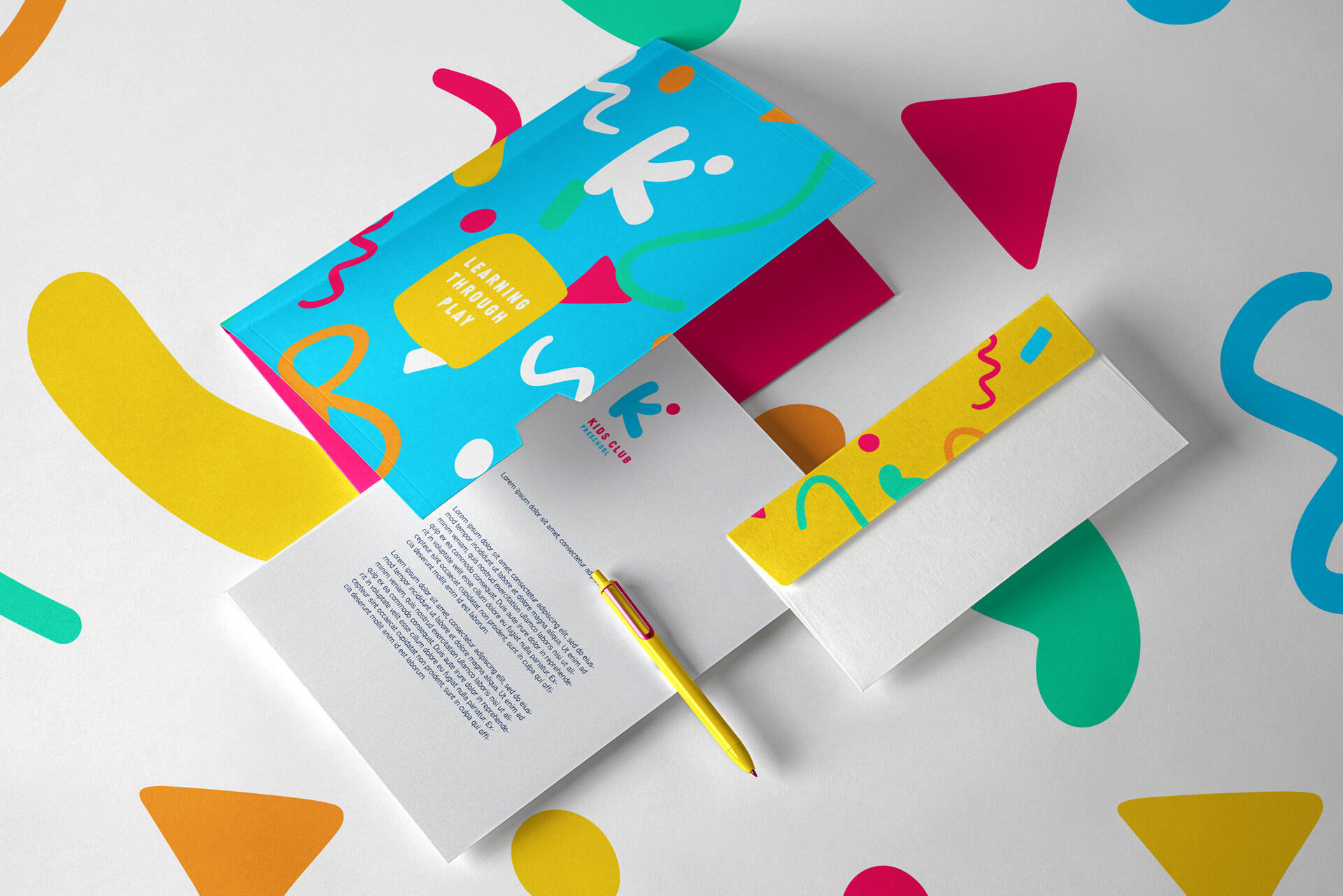
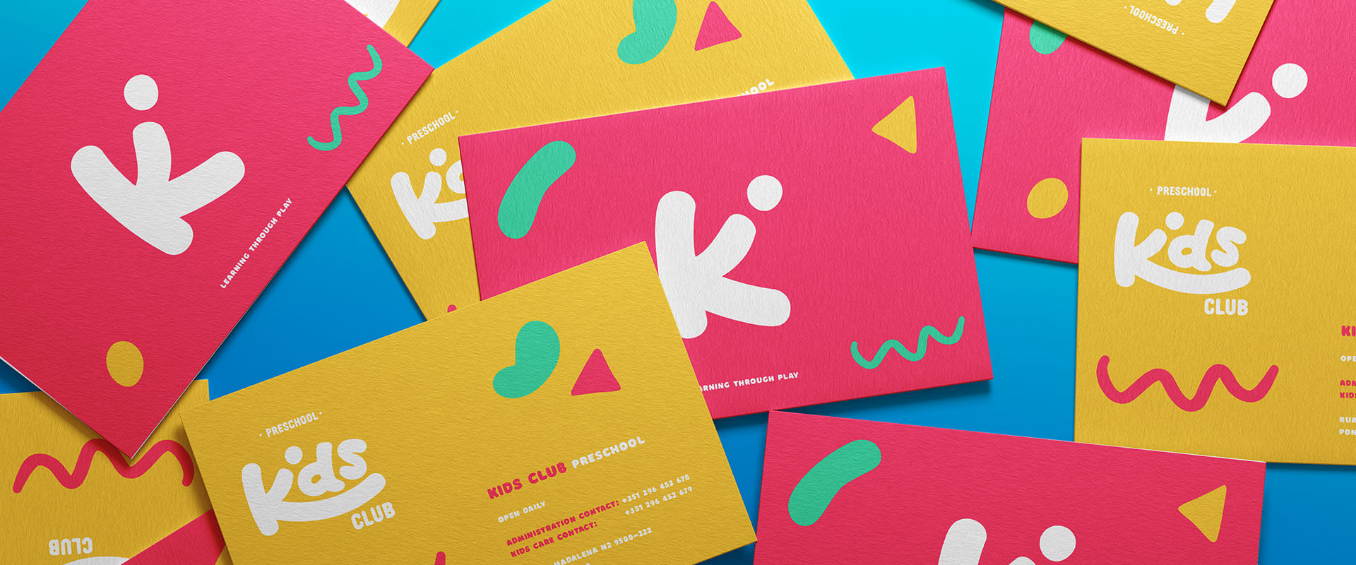
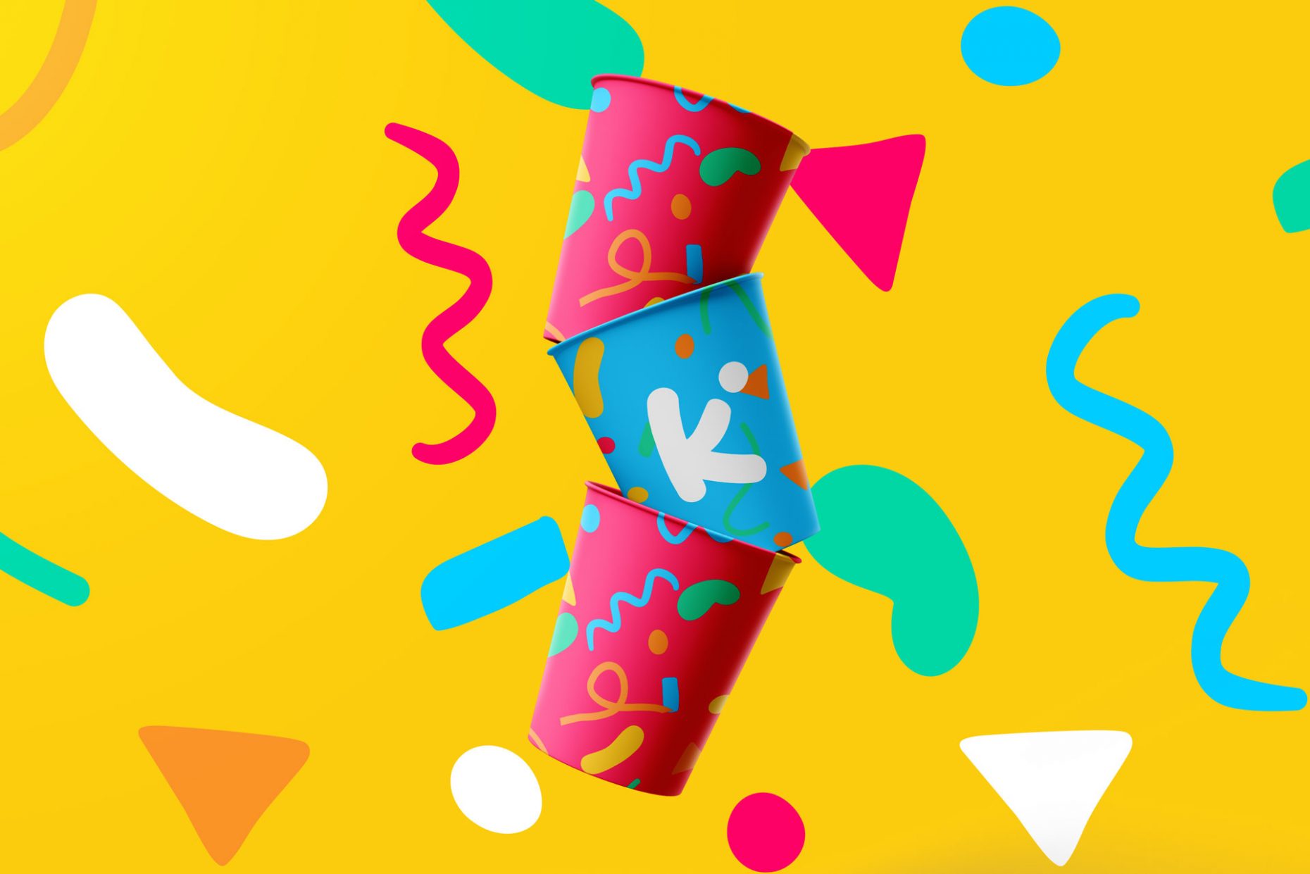
This branding is vibrant, joyful and very kids oriented. It consists in a fresh and bold but also familiar colour palette and simple shapes.
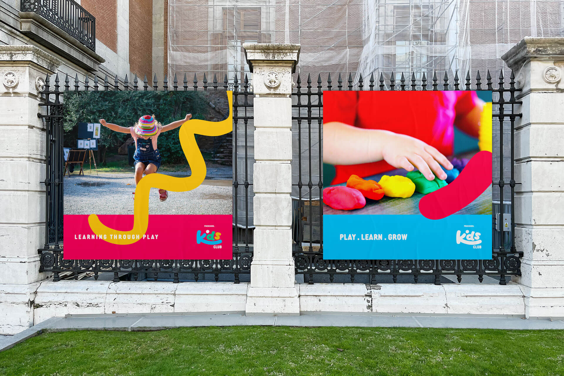
Children are naturally drawn to bright colors, playful shapes, and fun imagery, so this bold and fun brand was meant to create a welcoming and inviting atmosphere.
Through all communications these shapes are used, defining the brand identity – which makes this brand flexible and dynamic.
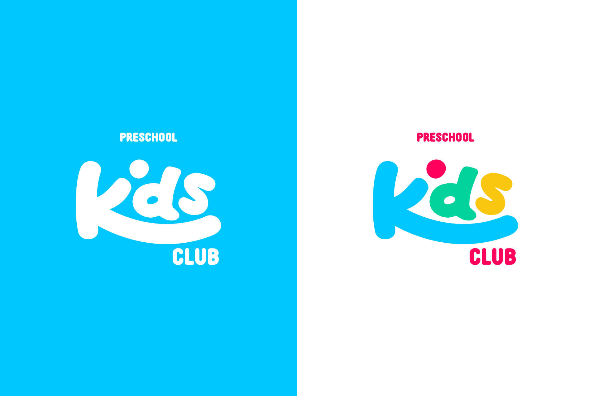

The brand’s use of bold colors is a key part of its visual identity and helps to convey the brand’s energetic and playful personality. This use of bold colors serve to attract the attention of children and create a fun and exciting atmosphere, encouraging them to engage with the preschool.
